WaterSource
Overview:
During the pandemic in 2020 there was a surge in outdoor recreation. This surge resulted in an increased need for acquiring information among the paddling community about prospective water trail routes. This case study focuses on the design development of WaterSource, an app that supports gathering pertinent information for planning a paddle on the upper portion of the Susquehanna River located in the state of New York.
Although the Susquehanna River is highly valued for outdoor recreation among the East Coast paddling community and is the third largest river in the United States, paddlers experience planning for a paddling trip on the New York portion as time-consuming, inaccurate, and dangerous.
Solution:
WaterSource is designed to provide accurate, accessible, and detailed information about the characteristics of the Susquehanna River situated in New York.
Interactive Map:
Showing GPS locations for accurate locations of important safety information.
Highlighted Details:
Quick factual reference for important information about each route.
My Role:
I independently led all aspects of this design project to include visual, UX, and UI design elements. I incorporated constructive feedback from interview and user usability participants that lead to multiple ideations improving the functionality and overall design of the app.
Process:
Using a combination of design thinking and lean UX methodologies to include a research, design, and validation phase during a 5-week time period taking place between May 23, 2023 to June 26, 2023.
Research:
Research was conducted to explore how waterways are currently being documented within this area and what information proves pertinent to a paddler when planning for a paddling trip.
Following my research it became vividly apparent that paddlers upheld safety and accuracy with the utmost importance when planning a paddle.
The question arose... How might we ensure safety by acquiring accurate and pertinent information while planning for a paddling trip on the New York portion of the Susquehanna River?

“You have to know the river and really know it’s safe.”
Jeff F.
“To me safety is a huge issue.”
Larry R.
“Had maps but also tagged along with the GPS on the phone, nice to track progress precisely too.”
Dana R.
Persona:
WaterSource is for experienced paddlers that plan their own paddling excursions and have their own equipment. It is designed for paddlers that do extended day and overnight trips.
User Stories:
Empathizing with the user and addressing pain points the user experiences when planning for a paddle lead to the original inclusion of weather, river conditions, put in/take out locations, and potential hazards along the river. Following my research and interviews, it became evident that not all of my chosen user stories held the same importance. That many paddlers already have trustworthy resources to acquire accurate weather and river conditions. I decided to address the most essential information that paddlers did not have easy access to.
Early Ideations:
My early ideation sketches placed emphasis on providing information that proved paramount to planning for a safe paddling experience that I obtained from my research and conducting interviews. This information included weather, river conditions, maps, and route descriptions.
Wireframing:
After performing guerilla testing of my prototype which included my early sketches, slight changes were incorporated into the design for the wireframes:
The label “River Trails” changed to “Water Trails”, users were more familiar with paddling routes being referred to as Water Trails.
Stonger icons were incorporated in conjunction with descriptive text to give verbal and visual clues to what each selection contained.
Overall, the design flow was translatable to users and experienced minimal difficulty navigating the app.
Visual Design Process:
Purposefully kept the app simplified in visual design. I aimed to ground the app in soothing and trustworthy colors organizing it in a symmetrical and linear fashion to limit visual distraction.
Mission: To empower users to plan their own paddling experience with confidence. Keeping safety and navigation cornerstones to any paddling experience.
Brand Attributes: Adventurous, Calm, Trustworthy, Effortless, Dependable
High Fidelity Mockup:
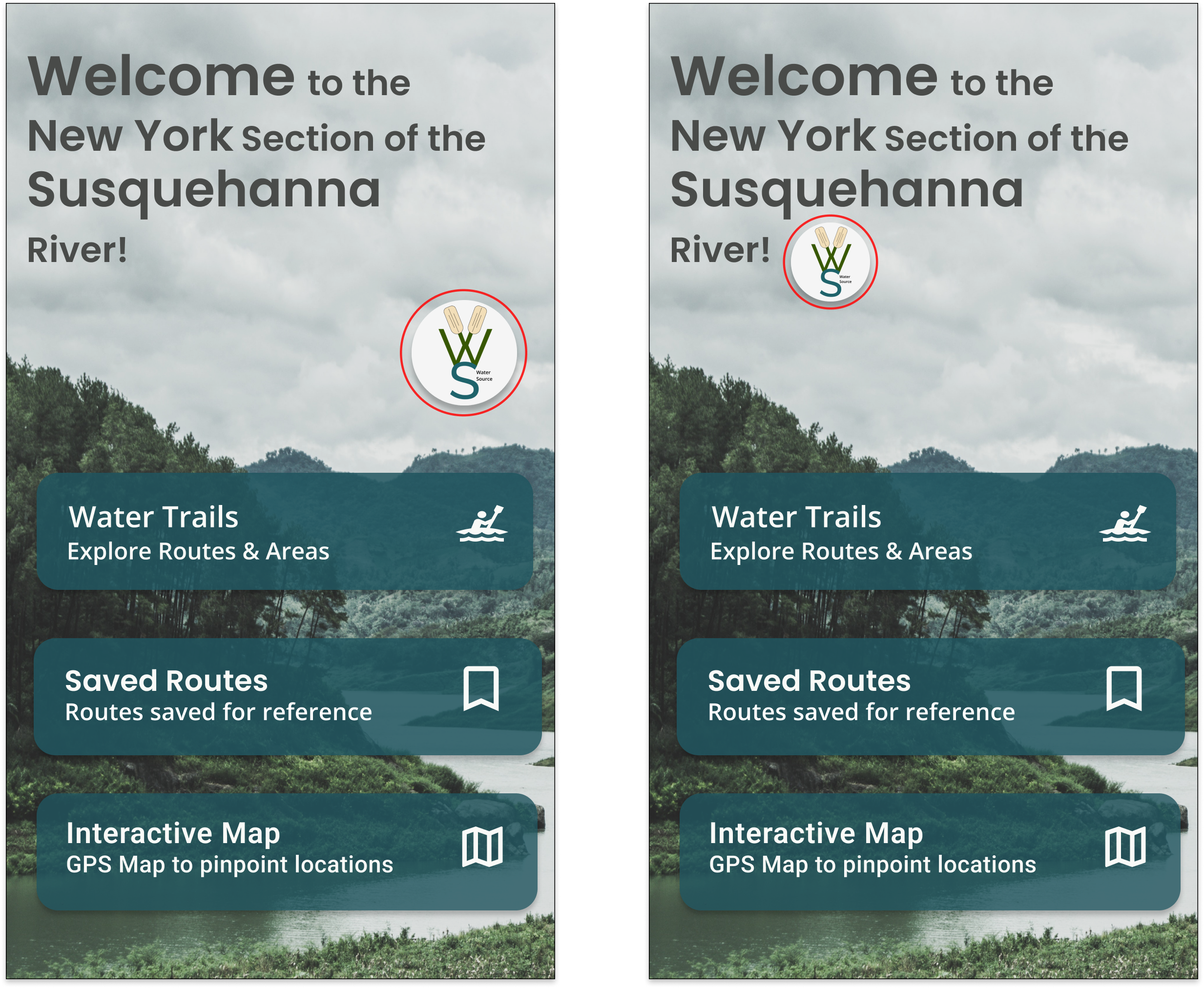
Previous Homepage
Simplified navigation choices on homepage:
During user testing I discovered that users were overwhelmed by the choices for navigation on the homepage. Simplifying their choices made for quicker navigation. I also discovered during interviews that paddlers already sourced their weather and river conditions from trusted sources and that adding these elements into my design was not necessary.
Final Homepage
Minimized logo size to signify design element instead of CTA button:
The logo on the homepage proved confusing for users during my user testing. Many attempted to use the logo as a CTA button. After scaling down the size of the logo and repositioning it closer to text, users began to view it as a design feature and less as a CTA button.
2. Previous Route Option Page
Final Route Option Page
Bookmark option and logo navigation:
The addition of a saved route feature was added to the app. A bookmark icon placed next to each route enables a user to return to a specific route easily. The homepage logo in the upper right of each page now provides the homepage navigation option from anywhere in the app.
3. Previous Description Page
Final Description Page
Description of each route simplified:
Information describing each route was reduced only displaying pertinent quickly digestible information. This reduction was accompanied by icons signifying the most important aspects of the description placing more emphasis on these sections as a user quickly scans the description for necessary information.
4. Previous Map Design
Improved map design features:
Incorporated a filter control enabling users to pinpoint locations on a map accompanied with GPS coordinates for accuracy.
Final Map Design
WaterSource Prototype
Future Iterations
Add links to additional supportive safety features such as weather/river conditions that paddlers trust.
Make additions to include other portions of the Susquehanna River.
Include points of interests along routes.


