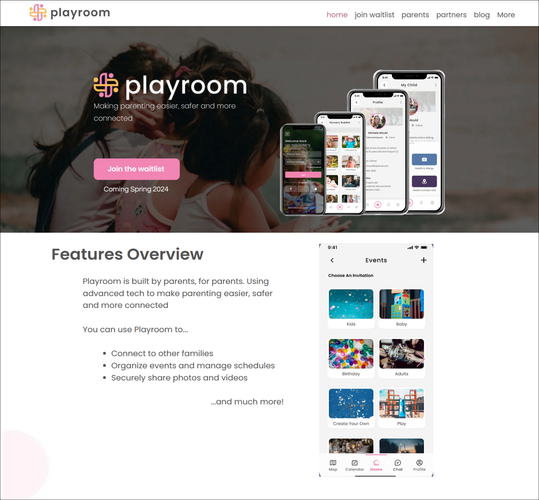
An application designed to make parenting easier, safer, and more connected.
Overview:
Playroom is a free social platform for parents to safely connect with other families of children who attend the same child care facilities. The application offers many features that promote connection, organization, and secure online sharing in a quick and effective fashion. Playroom’s ultimate purpose is to unite a child’s individual social and supportive networks into one location.
Problem:
Currently playroom has a website and mobile app designed in Wix. Both are mediocre in user navigation, feature comprehension, and visual appeal.
Main pain points are as follows:
The site does not effectively deliver an intuitive user flow for navigation purposes.
The site’s text is neither concise nor digestible resulting in user confusion around what the application has to offer.
Visuals are unorganized and haphazardly used resulting in a lack of an overall visual cohesion throughout the site.
The client’s request is to implement improvements to the site’s UX/UI design elements in order to enhance brand identity, promote intuitive user site navigation, and ultimately prompt users to join playroom’s mailing list in order to be notified of its future launch date.

Solution:
The below ideations were made to playroom’s overall UI/UX design to establish a direct user flow, visual and informational hierarchy, and visual overall site cohesion.
The landing page now offers an overview of the features it promotes.
Visuals now display what the actual product will look like.
Information is now presented in a hierarchical fashion.
The user now understands that they are signing up for a waiting list for a product that will be launch in the Spring of 2024.
Text is concise and quickly absorbable.

My Role:
I lead a team of three UX/UI designers, including myself, that sought to address all aspects of this design project to include requests made by our client.
My sole contributions to this project were:
Point of contact between design team and client.
Coordinate and organize weekly team/client meetings.
Create and design the join and contact page.
Devise our team’s project plan, timeline scope, and user testing script.
Perform user testing interviews.
Consolidate team user interview findings and document our iterations in preparation to present them as a deliverable hand off to our client.
Process:
Using a combination of design thinking and lean UX methodologies to include a design, research, and validation phase during a 4 week time period taking place between July 21, 2023 to August 16, 2023. Our team obtained previous design deliverables from the client to include Figma files, google docs, and playroom Wix website editor access. The design team collaborated with the client to implement necessary initial UX/UI design iterations necessary to proceed forward to user testing. After initial iterations were made, user testing commenced and valuable user testing feedback was obtained. Our team consolidated our findings and made further iterations before publishing playroom’s site for the client to begin using for public use.
Design
User Flow:
Creating a user flow ensured users two primary options from the landing page, to navigate the site as a parent or as a partner. It was important to the client to supply this distinction between the two user identities within the flow because the site advertises the product differently depending on what identity the user associates themselves with.
Within the flow pictured below, crucial areas are highlighted, designating where users make a decision entering the site either as a parent or a partner.
Initial Iterations:
The overall site lacked descriptive information and visuals to relay exactly what the product offered. Navigation within the site also proved cumbersome for the top menu bar was not situated in a fixed position making it inaccessible when the user explored the site. We presented our iteration ideas to the client and they were well received giving us permission to move forward.
Our design team implemented the below iterations for final client review.

Original Homepage:
Initial Iterations to Homepage:

Contact Page:
Original Join Page:

Initial Iterations to Join Page:
Final Round of Iterations:
User testing revealed additional pain points that users experienced while exploring the site. Our team resolved newly discovered pain points by dividing the work among team members and implementing a second round of iterations. My responsibility was to update the join page and provide feedback on new iterations to homepage and hold each member of our design team accountable to perform their designated iterations.
Final Homepage:
Final Parent’s Page:
Final Join Page:
Conclusion:
The client was supportive and responded favorably in regards to our second round of iterations. The client expressed satisfaction on how the design team addressed UX/UI challenges and promoted site navigability. Given the time constraint of 4 weeks, the design team provided our client with possible further iterations that could be implemented. Overall, during this project the design team and the client aligned on all iterations. All those working on this project ultimately created a site that effectively advertises what the product offers while following a user flow as either as a parent or a partner.
Future Iterations:
Test to validate new implemented ideations with new participants.
Analyze feedback.
Add user reviews and quotes for potential future users to see what others are saying.
Incorporate a product demo to showcase how product works in real-time.
Have an option for users to share product with other potential users.


